
A couple weeks ago, my product team at ADstruc gave me a chance to talk about CSS.
I then took a deeper look at some CSS tricks that I think are rarely discussed by people but still amazing to learn about them.
Here are 3 cool hidden CSS tricks I found that fascinate me and 2 regular CSS3 tutorials.
3 CSS Tricks
- Counters
- Navigation Separator
- Columns
Counters
If you’re a programmer, you will definitely use counter somewhere in your code whether it is PHP, JavaScript, Ruby, or Pyhon.
You can actually do the similar thing in CSS with counter-reset, counter-increment, and counter(variableName).
If you take a look at the HTML below:
- counter-reset:section was used to create a variable named section and set the value to 0.
- counter-increment: section was used to increment the section counter by 1.
- counter(section) was used to display the counter.
<!DOCTYPE html>
<html>
    <head>
        <style>

            body {
                counter-reset: section; /* Set the section counter to 0 */
                font-size: 2em;
            }

            span:before {
                counter-increment: section; /* Increment the section counter*/
                content: "[" counter(section) "]"; /* Display the counter */
            }

            span {
                color: red;
                font-size: 0.4em;
                font-weight: bold;
            }

        </style>
    </head>

    <body>
        <p>Lorem Ipsum is simply dummy text of the printing and typesetting<span></span> industry. Lorem Ipsum has been the industry's standard dummy text ever since the 1500s, when an unknown printer took a galley of type and scrambled it to make a type specimen book. It has survived<span></span> not only five centuries, but also the leap into electronic typesetting, remaining essentially unchanged. It was popularised in the 1960s with the release of Letraset sheets containing Lorem Ipsum passages, and more recently with desktop publishing software like Aldus PageMaker<span></span> including versions of Lorem Ipsum.</p>
    </body>
</html>

Counter Demo
Navigation Separator
Sometimes when we are surfing through the internet, we will come across websites with navigation links with separator between them.
Solution 1: Most Common Solution :first-child Pseudo-class Selector
Most people who has a working knowledge of CSS will apply border-left on li tags and then use CSS pseudo-class first-child to remove the extra border-left like below:
li {
    display: inline;
    padding: 0 20px;
    border-left: 1px solid black;
}

li:first-child {
    border-left: none;
}
My Favorite Solution: Adjacent Selector
li + li {
    border-left: 1px solid black;
}
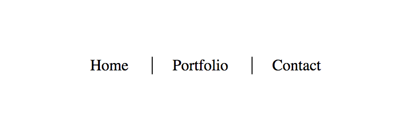
Adjacent selector will select only the element that is immediately preceded by the former element. In this case, only the li after another li wil have a black border-left. So if you look at the example below, only Portfolio and Contact will have a border of left.
<!DOCTYPE html>
<html>
    <head>
        <style>
            ul {
                list-style: none;
                text-align: center;
            }

            li {
                display: inline;
                padding: 0 20px;
            }

            li + li {
                border-left: 1px solid black;
            }
        </style>
    </head>
    <body>
        <nav>
            <ul>
                <li>Home</li>
                <li>Portfolio</li>
                <li>Contact</li>
            </ul>
        </nav>
    </body>
</html>
Navigation Demo
Columns in CSS
With columns in CSS, it is able to separate a block of text for us in columns.
<!DOCTYPE html>
<html>
    <head>
        <style>

            body {
                margin: 60px;
                line-height: 2em;
            }

            h1 {
                text-align: center;
                text-decoration: underline;
                margin-bottom: 50px;
            }

            .two-columns {
                -moz-columns: 2; -webkit-columns: 2; columns: 2;
            }

            .three-columns {
                -moz-columns: 3; -webkit-columns: 3; columns: 3;
            }

        </style>
    </head>
    <body>

        <h1> CSS COLUMNS </h1>

        <div class="three-columns">Lorem ipsum dolor sit amet, consectetur adipisicing elit,
        sed do eiusmod tempor incididunt ut labore et dolore magna aliqua. Ut enim ad minim veniam,
        quis nostrud exercitation ullamco laboris nisi ut aliquip ex ea commodo consequat.
        Duis aute irure dolor in reprehenderit in voluptate velit esse cillum dolore eu fugiat
        nulla pariatur. Excepteur sint occaecat cupidatat non proident, sunt in culpa
        qui officia deserunt mollit anim id est laborum</div>

        <br />

        <div class="two-columns">Lorem ipsum dolor sit amet, consectetur adipisicing elit,
        sed do eiusmod tempor incididunt ut labore et dolore magna aliqua. Ut enim ad minim veniam,
        quis nostrud exercitation ullamco laboris nisi ut aliquip ex ea commodo consequat.
        Duis aute irure dolor in reprehenderit in voluptate velit esse cillum dolore eu fugiat
        nulla pariatur. Excepteur sint occaecat cupidatat non proident, sunt in culpa
        qui officia deserunt mollit anim id est laborum</div>

    </body>
</html>
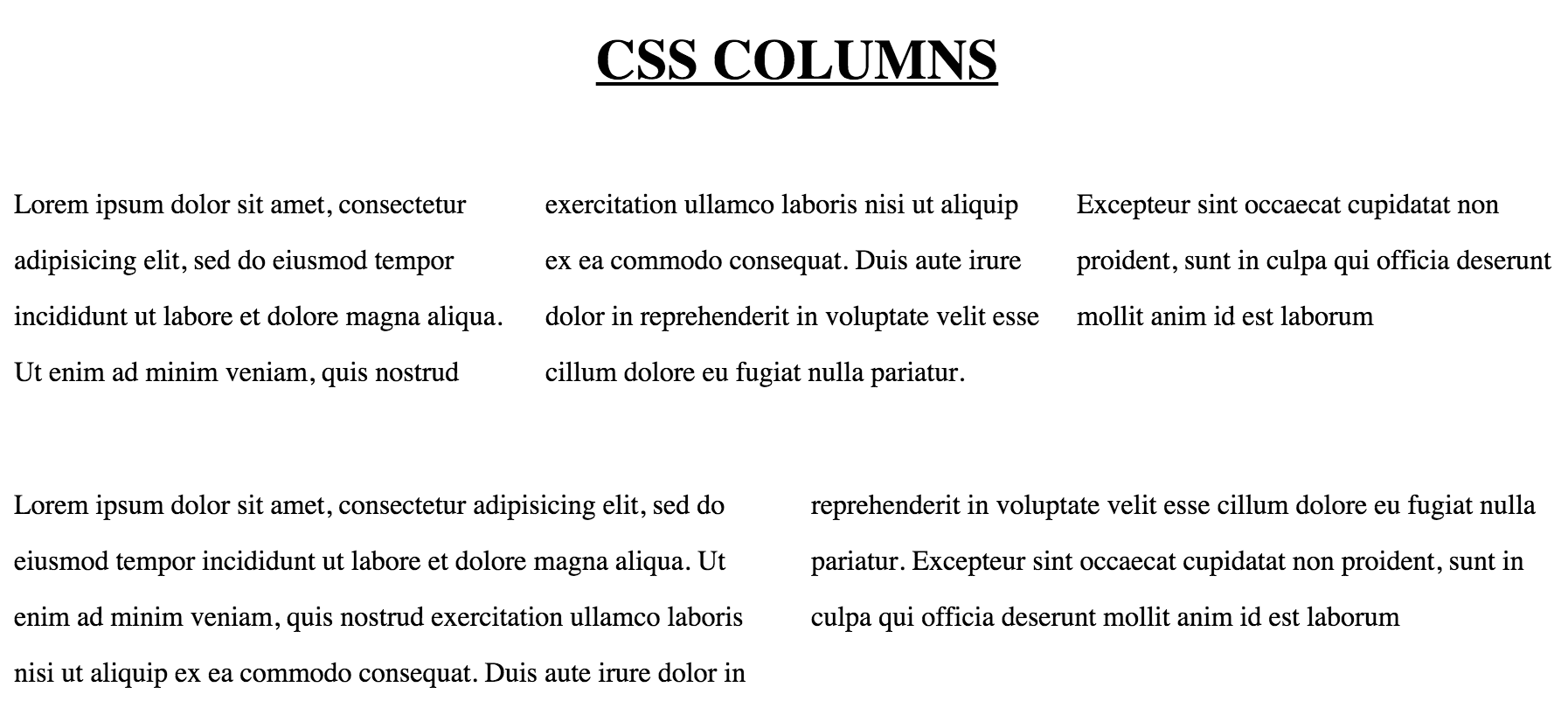
Columns Demo
2 CSS3 Tutorial
- 3D Button
- Animation
3D Button
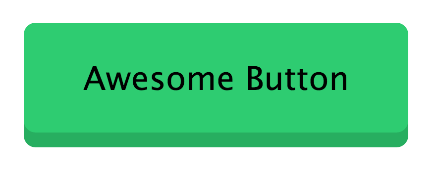
CSS3 comes with animation that we can perform on HTML elements. This simple tutorial will show you how to make a button presses down when clicked.
<!DOCTYPE html>
<html>
    <head>
        <style>

            button {
                background: #2ecc71;
                border-radius: 4px;
                margin: 0;
                outline: 0; /* No focus outline */
                padding: 12px 20px;
                border: 0;
                cursor: pointer;
                box-shadow: 0 5px 0 #27ae60; /* xOffset yOffset blur */
                transition: all .1s linear;
            }

            button:active {
                box-shadow: 0 2px 0 #27ae60; /* xOffset yOffset blur */
                transform: translateY(3px); /* move down */
            }

        </style>
    </head>
    <body>
        <button>Awesome Button</button>
    </body>
</html>
The way 3D effect works like this. Take a look at
button {
    transition: all .1s linear;
}

button:active {
    box-shadow: 0 2px 0 #27ae60; /* xOffset yOffset blur */
    transform: translateY(3px); /* move down */
}
When a button is clicked and held, it is in the button:active mode. At this time, the CSS3 transition effect will be activated and all CSS property will be changed as fast as 0.1 second.
So, this css pseudo-class will decrease the box-shadow yOffset from 5px to 2px. Then, it is using transform CSS property to translate the whole button down 3px. By doing this, it performs a 3D effect of a button being pressed down.
When the click is released, the CSS3 transition effect will lose it’s effect and go back to it’s original button state.
Button Demo
Animation
Another CSS3 feature is animation.
Here is an animation of a fish swimming…
<!DOCTYPE html>
<html>
    <head>
        <style>

            body {
                background: #31477d;
                width: 600px;
                height: 600px;
            }

            .fish {
                -webkit-animation-duration: 3.5s;
                -webkit-animation-name: swim;
                -webkit-animation-iteration-count: infinite;
                -webkit-animation-direction: alternate;
            }

            @-webkit-keyframes swim {
                from {
                    margin-left:100%;
                    width:50%
                }

                0% {
                    margin-top: 30%;
                    margin-left:80%;
                    width:40%;
                }

                50% {
                    margin-top: 40%;
                    margin-left:40%;
                    width:20%;
                }

                to {
                    margin-top: 20%;
                    margin-left:0%;
                    width:15%;
                }
            }

        </style>
    </head>
    <body>
        <img src="fish.gif" class="fish">
    </body>
</html
As you can see, we are assigning animation CSS properties to .fish class. This animation will run infinite time for 3.5s each way. Then it will alternate it’s direction every 3.5 seconds. I gave this animation function a name of swim.
Next thing we do is assign keyframes for this swim animation function. It must have from, and to. If you like to add additional keyframes, you can. I added two more - 0% and 50%. These keyframes means the percent completion of each animation each way. So at 1.75 seconds of each animation, which is 50% of 3.5s, I want the .fish class to have margin-top of 40%, margin-left of 40%, and width of 20%.
The final frame of the animation, which is defined in to means the fish will end up with margin-top of 20%, margin-left of 0% and width of 15%.